🚀 Get Amazon reviews. Free!
Learn how to optimize your ACOS using the RevenueWize Overview Dashboard and evaluate your advertising performance
The Overview dashboard is where we can evaluate our advertising performance.
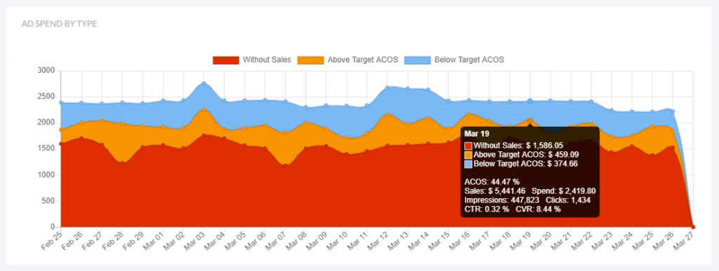
The ad spend by type graph at the top presents the breakdown of our ad spend performance over the last 30 days. Each color in the graph represents a different performance indicator.
Looking at the graph we can clearly see where our ad spend dollars are going. A lot of red means we are spending on things that are not generating sales, while a lot of blue means most of our spend is below our target ACOS so either we’re doing well or on the contrary there are opportunities we’re not taking advantage of and leaving money on the table.
Hovering above a specific date on the graph will provide a detailed breakdown of the performance for that day.
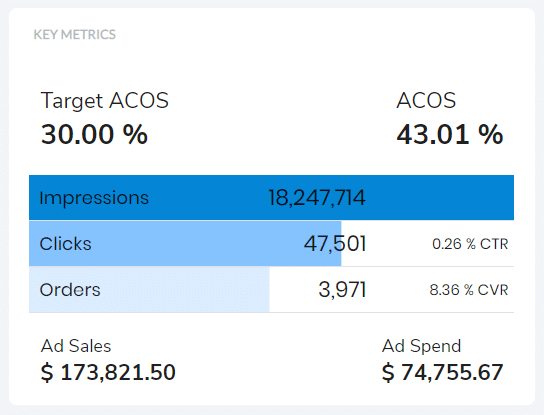
On the right of the graph we will find the key account metrics such as ACOS, impressions, clicks, orders, ad spend and more
Below the graph we will find 3 sections detailing our account performance: Exact Keywords with clicks, Active Search terms with clicks and Targeted ASINs with clicks.
The EXACT KEYWORDS section we will find a performance breakdown of our exact keywords according to different conditions
Clicking on ‘view’ next to each of these will direct us to a view where we can see them and take the necessary actions.
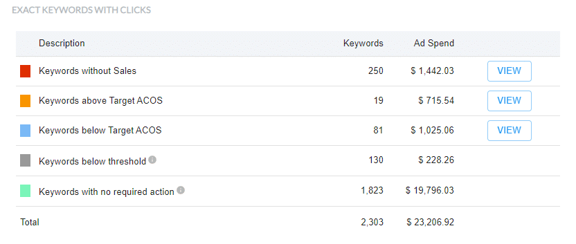
We’ve also included 2 additional scenarios
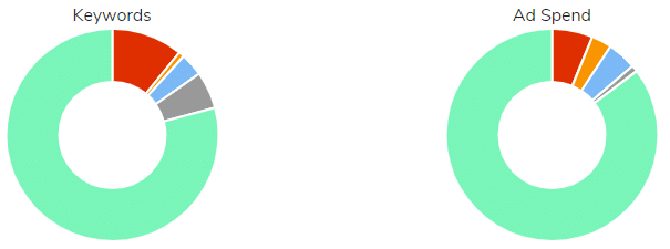
The pie charts on the right represent the keywords distribution based on their amount out the total keywords and next to it based on their portion of the ad spend. This helps understand how our keyword budget is currently being spent.
The SEARCH TERMS WITH CLICKS section provides a breakdown of all of the search terms coming from Auto, Broad and Phrase keywords. The system analyzes them and provides a breakdown similar to the one in the keywords section. It allows us to understand our search terms behavior and take the necessary actions on those that require our attention.

The last section is the TARGETED ASINS WITH CLICKS. Here we will find an analysis of all the ASINs we are targeting. The breakdown is similar to the one in the keyword and search term sections.

Filter
We can filter the results by one or more campaigns and 7, 14 or 30 days
Work Methodology
A typical day would include reviewing and handling each of the sections which the system has highlighted as requiring our attention.
Our objective is that all of our budget will appear under the ‘no action required’ condition. This means that we’re currently optimized or have taken all the steps to optimize our campaigns in this point of time and no further action is required. We will obviously need to review this on a continuous basis as the performance tends to change over time.
We can also access the recommendations from the left hand navigation instead of clicking on the view button.
